
I am a graphic designer and Illustrator... this is how I make my living. That is to say that I'm pretty positive I know what I'm doing when it comes to design. However, I work far more effectively when I design by hand first, scan the piece and use Photoshop to take the piece to the next level. Being an artist with a classical animation background, my work tends to lean towards the cartoon or comic spectrum of illustration. So, using those skills, I came up with a graphic that I felt truly reflected our look n' feel and kept our theme in mind...
... wait, let me back track here for a second. I want to elaborate on the theme of the album cover before we continue. Easy Way Out did easily agree on the title and theme... We wanted to create a positive message that proclaims our sense of pride in putting on such a powerful performance that makes any show we play - our show... regardless of who's headlining. This philosophy or rather "mantra" has really proven effective in helping us tap into that extra energy required to give you 200% every time we play a show. The phrase we chose to title the album is "Steal the Show".
That said, the first design, in my natural style totally conveyed this message... and, I felt, also provided a much needed sense of humour to our look n' feel. Here's the original album cover that will not be on the CDs you will be buying soon:

"It's too cartoon-ey"... "It's too kid-ish"... "we're not YTV muthaf***a!"... (sigh) the look and feel I was going for was now thrown out the window and so I was sent back to the drawing board with a highly detailed brief. "Not so cartoon-ey, but maybe like a tattoo,... oh and grimy... muthaf***a!"
I then sketched up a tattoo-like layout, classic tattoo banners, 2 crowbars for a frame...

...and the boys seemed to like the concept. Although after my reaction over the decision to nix my previous album cover, one has to wonder if they were just trying to avoid a repeat performance.
It was time to start realizing our vision of the new cover. The boys had more direction for me; "Make it look grimy!"... "Make it look sick!"... "Put our picture on it, we ain't humble muthaf***a!"
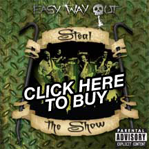
The album went through many revisions, multiple spell checks, last minute editing and 3 proofs, but it was all worth it. Here's a sneak peak of what the album looks like:

I wish I had a release date for you. But the lack thereof will hopefully drive your interest into a frenzied salivating urgent rush of rabid want or need. I can promise, that as soon as I know when the CD release party is... so will you.
Until next you read...
Jay Flores-Holz
EWO


No comments:
Post a Comment